
IEEE Internet Computing, March/April
2006:
Happy together: Sensors and users
This issue of Internet Computing is focused on data-driven applications in sensor networks, which, in a literal sense, might not seem to have much to do with user experience (UE). But, as I thought about the issue’s theme, it began to sound like a good topic for a column exactly because of its apparent distance from the typical (or stereotypical) concerns of user experience. My goal here is not to tell sensor people their business, nor do I mean to criticize articles that, at this writing, I haven’t even seen. Rather, I’m hoping to offer some insights into how UE people might think about this problem area and others like it, what issues they might raise, and what opportunities could arise by considering those issues. In other words, what would it be like to work with a UE specialist on a project like this (assuming that you’re not already)?
Let me start with my naïve, 100,000-foot-view of sensor-network applications. There is a collection — quite possibly a large collection — of sensors somewhere out in the world, collecting and pouring data into a database. Code looks at this data, and then analyzes it and interprets it in various ways: perhaps an ongoing view of what’s going on in the world according to the sensor data, a snapshot summary of what had been going on at a particular point in time, real-time, automatic detection of some conditions of significance to the application, or a combination of all three.
I realize I’ve just grossly oversimplified some readers’ life work, possibly including the authors of this issue’s articles. My apologies. Some of you are probably saying, “This guy might know something about user interfaces but he doesn’t know anything about sensor networks!” Well, you would be right. But there’s a lesson here: when you work with a UE specialist on a highly technical project, in most cases he or she will not be an expert in your domain, and will probably have some preconceptions about the domain that you might consider naïve or even incorrect. Some education of your UE partners will be required, but the good news is that those of us in this field are generally happy to meet you more than halfway — we know it’s the only way to get good results. For example, a friend spent seven years living and working on oil derricks to get to the point where he could design effective interfaces for the oil industry. In fact, one of the reasons that some of us work in this area is the opportunity to learn about a wide range of problems. We find it fun.
So, for the moment, grant me my naïveté, because even this simple view of the sensor-network problem identifies some areas in which user issues will have a significant effect on the system’s ultimate success. And, as we’ll see, thinking about these issues up front will make the overall system development job easier, not harder.
Problem 1: Supporting data interpretation
The first issue in this area is how the people dealing with the results of sensor-network analysis can make sense out of the potentially huge amount of data that the network can produce. This is difficult, of course, because the amount and complexity of data can be overwhelming. Many sensors can produce lots of data, and, from a user perspective, the problem grows geometrically larger with the number of sensors and the frequency with which they report data. Furthermore, the definition of “make sense” can change from moment to moment, based on the user’s immediate task and the circumstances the world imposes on the user through the sensor data.
As usual, let’s start with who the users are and what they will want or need to do. One obvious task for problem areas like this one is to get some sense of the “big picture,” which means finding a good way to reduce the huge amount of generated data to a more manageable size and form and present it in a useful, understandable way. Visualization is one technique to consider for these kinds of problems, since we know that people are really good at deriving meaning from well-designed visual presentations of even large amounts of information. Consider this snapshot (Figure 1) from Yahoo! Maps (https://maps.yahoo.com), which has live traffic information superimposed over a map of Los Angeles:
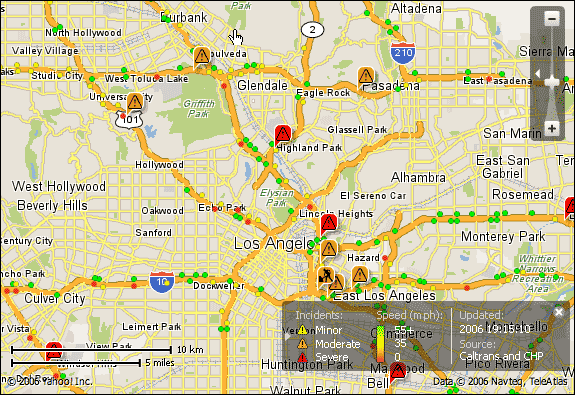
Colored dots show how traffic is moving, as derived from sensors and cameras built into the freeway system — green is fast, red is slow — and other icons provide warnings of road construction or accidents. All told, this image provides an excellent high-level view of the traffic conditions of a 350-square-mile area. Still, its usefulness depends on the exact user task: It’s great for planning a route around Los Angeles at the time the view was generated, but it would be useless for someone who wanted to know the top 10 trouble spots in LA today, this month, or this year. That would require a different slice through the database, and a different presentation of that data.
Zooming in
The second significant task is how to get detailed information about specific parts of the data — what’s happening at that offramp on the Ventura Freeway? If the interface is built around a visualization, you might let users visually “zoom” down to a finer-grained level of detail, much as do Yahoo! Maps and other mapping tools. As you zoom the display, a general visualization might unfold into a finer-grained set of more specific presentations — a generalized “yellow” state of caution around an area at a low-level of detail might turn into a collection of green (good) and red (bad) points, once the map offers enough detail that the individual points can be seen.
I don’t mean to imply that visualizations are always the right way to handle sensor data, nor that a visual notion of zooming in should be taken too literally. Other problem areas might be well-suited by a tabular display aggregating data over time, such as one that monitors changes in pressure levels inside a power plant. Still others might want to report generalized views of a process: Imagine an automobile production line with RFID tags on all the components and an application that summarizes the status of that line — production capacity, bottlenecks, and so on. The demands of the task and the capabilities of your users dominate, as usual. But the need to provide both “big picture” and some sense of “zoomed-in” views of information will likely be a part of what you want to achieve with an interface for these kinds of data. Furthermore, the measure of success for the interface is likely to be the fit between those two views, and, in particular, whether you can move back and forth between the different levels of detail without losing either one, or a sense of how the two fit together.
Problem 2: How to present alerts?
Let’s assume that part of the sensor system watches out for specific, important situations — such as the failure of a safety system in a power plant — and produces an alert when they’re detected. This is something that, if the interpretation process is feasible, computers can often do better than people: aggregate lots of data, repeatedly match it against well-defined patterns, and report when matches are found. As before, I’ll take the details of the matching process for granted; I have a few questions in this area from a UE perspective.
How should the information be presented in the alert?
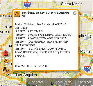
As we saw with the earlier traffic example, it’s possible to augment a visualization with notifications of alert conditions; here, those conditions correspond to accidents, road work, and the like. As shown in Figure 2, clicking on one of the “warning” icons produces a textual view of detailed information about the problem item (extent, duration, who’s in charge, resolution time, and so on) that conveys important information in a way that a purely graphical presentation could not.
What kinds of control should users have over the alert mechanisms?
Here we encounter such questions as: Can alerts be enabled or disabled? Can a single set of alerts simply be hard-coded into the system? Can an appropriately authorized user modify alert properties? Are they simple parameter changes to an otherwise fixed set of rules (for example, “alert me when the core temperature gets above x degrees”)? Or will some users need to create, modify, or delete alerts on an ongoing basis, such that they’ll need a separate application to create and modify the alerts? Hence, we need to ask:
- How are these changes made? What is the appropriate interface for the users’ tasks of controlling these alerts? Can simple changes be made with equally simple parameter changes? Or must logic diagrams or rule editors be used to create more complex ones?
- Who makes the changes? What skills and expertise do these users bring to the alert definition task and how will those abilities frame the interface design?
Thus we see that managing the nature of the alerts is a completely different task than monitoring the data, with a different set of interface problems to think about — different goals, users, and requirements. They must be addressed separately, in ways that capture their individual needs.
Implications for system design
To reinforce a point I’ve made before: interface design issues must be thought through at the beginning of the project, not at the end. Here in data-driven applications, it matters because of the potentially massive amounts of data involved in a sensor-based system. The big question facing the interface designers is whether the underlying data management system’s architecture will provide the right kinds of access to the data being collected by the sensor network. Zooming from a high-level view of a data set to a more detailed view implies that much of the data can be extracted from the database and aggregated into an appropriate form very quickly. Thus, there’s a direct connection between the interface’s design and that of the underlying sensor-management system, all the way down to its algorithms, data structures, and database design. If this connection isn’t handled properly, the system’s responsiveness will suffer or fail, and the good intentions of the interface design could be lost unless significant (and costly) redesign and redevelopment work is done. Figuring out the interface first means that the total system development is based on a complete set of requirements, and work can occur with assurance that the project’s goals can be achieved.
The final message is that, although sensor-network management presents a unique set of challenges, the usual rules of user-centered design still apply: Know your users; know their tasks; design, test, and repeat. In some highly technical domains, you might be designing for skilled, experienced users with a clear foundation of domain knowledge and expertise. From a UE design perspective, this means that the designers can assume the presence of this knowledge about the domain, and design the system around it. The interface that results could well be impenetrable to anybody outside the domain, but that might be okay — there’s nothing wrong with building interfaces for experts if that’s who your users are. The catch is that the UI designers will have to learn enough about the domain that they can do the design, because so much of what will make it an effective interface is bound up in the domain’s details. As the design proceeds, the first answer you might hear to many of your questions could be “it depends...,” but just interpret this as your UE specialist’s concern to really understand your problem before leaping to the conclusion of a design. That’s the route that will get you a great interface, and a great user experience.
Jim Miller is principal of Miramontes Interactive, an interaction design consultancy. His research interests include Web-based application design, Internet community development, consumer Internet appliances, intelligent interfaces, and usability evaluation methods. Miller received a PhD in psychology from UCLA. He is a member and past chair of SIGCHI, the ACM special interest group on human-computer interaction. Contact him at jmiller@miramontes.com.
For further reading
I’ve talked a lot about visualization; here are a couple of good starting places to learn more about this part of the user experience world.
Edward R. Tufte,The Visual Display of Quantitative Information, Graphics Press, 2001. The classic text on information visualization, and a simply beautiful book to boot.
Stuart K. Card, Jock D. Mackinlay, and Ben Shneiderman, Readings in Information Visualization: Using Vision to Think, Morgan Kaufmann, 1998. An excellent collection of articles of a broad collection of visualization techniques.